Bitcoin Price Charts
Insightful charts that suggest Bitcoin's price is heading up
TLDR:
Bitcoin’s been around for some 15 years now meaning we have a fair amount of history to learn from and trends to analyse, which we do below.
Most of the charts we take a look at suggest a leg up in BTC price could be coming very soon, however markets are impossible to predict.
You can find most of these charts and more at bitcoinmagazinepro.com/charts.
As we head into the fourth quarter of the year, there are plenty of indicators that suggest Bitcoin price may begin picking up again, and consequently lifting the rest of the market.
While it’s impossible to predict what’ll happen in the market there are certainly trends. So this week I wanted to look at a few of the most interesting charts that show these trends.
Bitcoin’s Price
Bitcoin’s price is impossible to predict, yet its movements are the biggest influence on the rest of the crypto market. When BTC price trends upwards, the whole market tends to trend upwards too, and when it retreats back down so do other crypto assets tend to get pushed back down too.
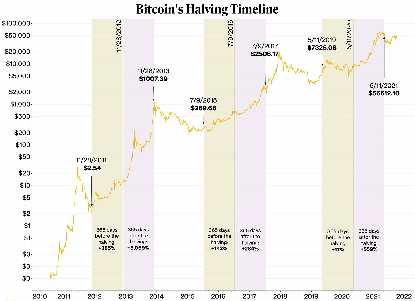
With a 15 year history certain patterns and trends have emerged. One of the most notable patterns for example are the 4-year cycles that are closely tied to the regular Bitcoin Halvings every 4 years, which I’ve already covered here before.
And accordingly some of these patterns and trends appear to show that we’re moving into a period where we’re likely to see a large upward BTC price movement.
Below I share some of these trends in charts, so that you can be aware of them and know where to look for yourself in the future. Note that most of the charts I’m referencing can be found here: www.bitcoinmagazinepro.com/charts
4-Year Cycles
Just as a refresher, crypto historically has followed a very clear pattern of 4 year cycles with 3 years up and 1 year down. You can read this post I wrote on the 4 year cycles to understand the reasoning behind this further.
For now in the current post we’re just looking at it graphically, and roughly speaking the cycles look a bit like this graph below, where the green section displays the 3 years of upward movement and the red shows 1 year of downward movement.
Considering that the last cycle’s peak happened in 2021 and ended early 2023, we’re now around 1.5 - 2 years into the bull-run of the current cycle. That gives around 1 - 1.5 years more of this bull-run, and historically this is where things have gone parabolic and BTC has reached new all time highs (ATHs).
As shown above, in all the previous cycles Bitcoin went through this aggressive climb upwards some months after the Bitcoin halving, not before. With the halving approximately 6 months ago, we are very much in the right place now if the 4-year cycles continue.
Purely by studying the history of these cycles, it would appear that we are entering the parabolic mania phase where BTC price shoots up massively.
Stock-to-Flow Model
This chart shows the infamous model created by prolific Bitcoiner Plan B. I’ve mentioned this chart a few times in my previous posts as it’s one of the most famous charts. In fact I recommend going to Plan B’s Youtube to learn even more about Bitcoin charts in general, he’s one of the best people to follow on this front.
The Stock-to-Flow (S2F) model compares BTC’s price action to that of rare metals like gold and silver. Rare metals like gold are scarce and hard to mine, and therefore good stores of value which is pretty much the same as Bitcoin, as I covered last week, hence warranting this comparison.
This graph indicates the halving dates as crucial moments for the price to trend upwards, which coincides with the graph in the previous section. This is an important part of the model as it’s at every halving that the “flow” of new BTC halves, and its proportion against the “stock” of BTC available jumps up dramatically.
Assuming the demand stays the same, the proportional change in stock-to-flow creates supply-side pressure that also pushes the price up. If you look above you’ll see that over the long-run this model has done pretty well, and it suggests a leg-up coming next.
Global Liquidity (M2)
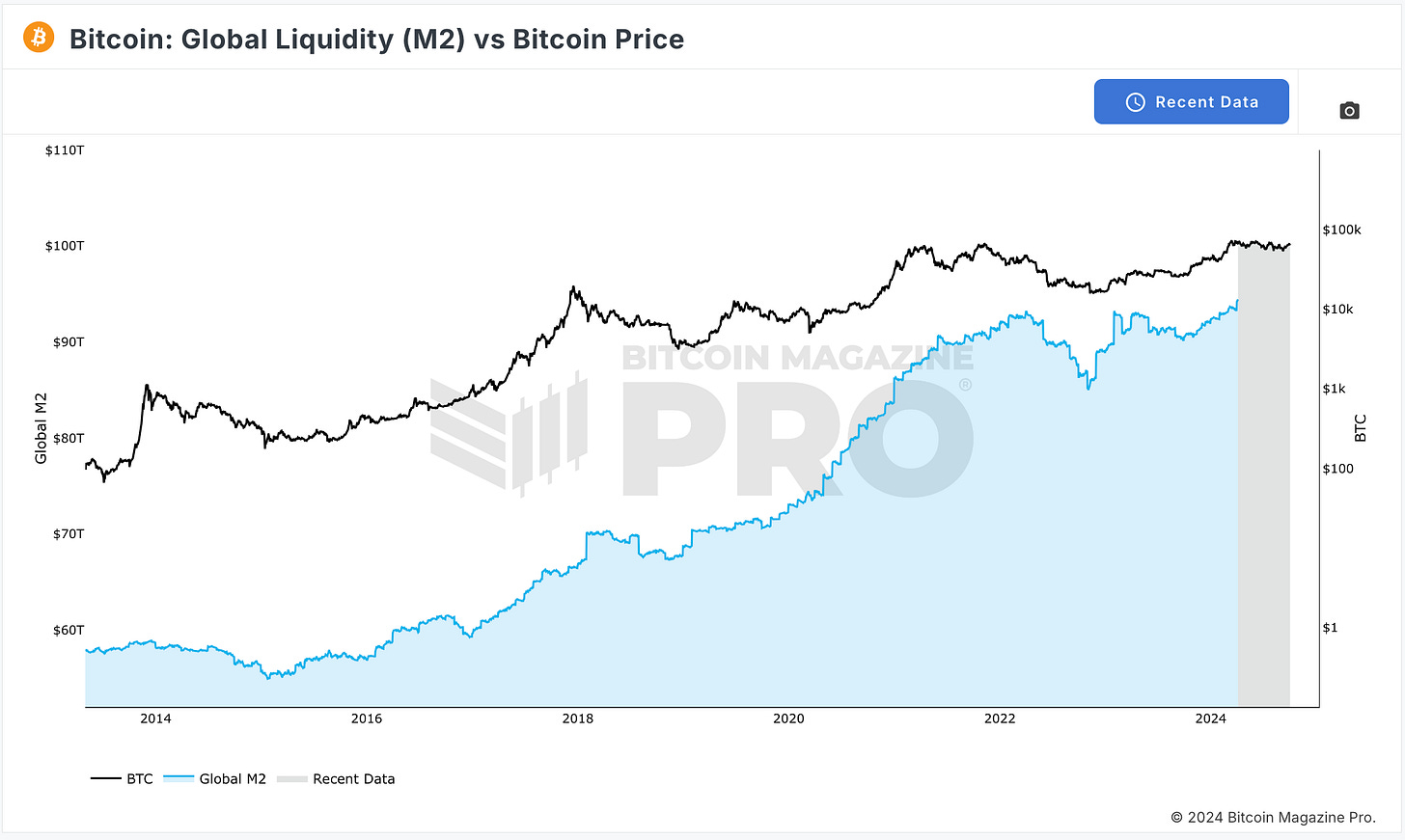
Global liqudity, or M2, refers to the total supply of cash in the world economy. It’s calculated by tracking the reports from major central banks, including both the cash and liabilities they report in their respective economies.
As governments print more money to pay off their ever increasing debts, they debase their currencies making them worth less over time, which incentivises money to flow into scarce assets to avoid losing against inflation.
Among those scarce assets Bitcoin stands as one of the best ones out there, and a digital alternative to gold, as mentioned above. Historically as M2 has grown BTC price has risen too.
Recently the US FED lowered interest rates and signalled a return to quantative easing, meanwhiile China just created their largest financial stimulus ever of an estimated $1.07 trillion, around 6% of their total GDP, to stimulate their economy. Accordingly we’re seeing the global money supply grow!
Looking at the graph you can see that this appears to be the case with recent data suggesting M2 will head up further, showing yet another bullish indicator for BTC.
200-Week Moving Average
The 200 WMA is quite literally calculated by adding up the price of BTC on the past 200 weeks (ie. around 4 years) and dividing it through by 200. It’s a very simple calculation but helps to give a long-term trend of BTC’s price.
Historically BTC has barely ever dropped below the 200 WMA, so it sets a theoretical floor price for BTC. The 200 WMA has been continuously rising, meaning this theoretical floor is growing higher and higher.
In the chart above the 200 WMA is shown by the black line, and as you can see BTC’s price has rarely ever dipped below it. Right now the floor is around $39k, so we can imagine that even if BTC were to have a sharp drop, it would be unlikely to fall below that level.
The blue dots suggest there’s still al ot of space for BTC price to balloon away from the 200 WMA before it becomes over-extended and needs to drop back down.
MVRV Z-Score
This graph compares Bitcoin’s market cap (ie. BTC price x total supply), also known as MV, with Realised market cap (ie. BTC realised price x total supply), also known as RV.
Realised price takes the price at which all Bitcoin were last moved and averages them out. So if people had on average bought 1 BTC for $40k, and now 1 BTC is $60k, you’ll get an RV of $40k x total supply and MV of $60k x total supply.
In the graph below MV is the black line and RV the blue line. Meanwhile the Z-score is the orange line, which is what we’re interested in, and shows a standard deviation between these two lines, in other words it shows the difference between them.
Historically when the Z score is in the green box it’s been a great time to buy, while when it’s in the pink box (the MVRV region) it’s overpriced and a good time to sell.
And as you can see this graph lines up very nicely with the 4-year cycles, showing Z-score peaks on the cycle peaks, and troths on the lowest point of the cycle. If the trend repeats itself then we can imagine that another upward motion will come soon.
Hash Rate
The hash rate represents the amount of hashing power that’s used to mine Bitcoin. Bitcoin maintains 10 minute block times by adjusting the difficulty based on the overall hashing power. So more miners, effectively just means more security for Bitcoin. We covered this in detail before in this hyperlinked post a few weeks ago.
As you can see below Bitcoin’s hashrate has been continuously rising significantly over time.
Although this graph is not necessarily helpful to understand BTC’s price dynamics, it is helpful to understand just how much more secure and “stronger” the network keeps getting, providing an ever more valuable asset to hold.
Bitcoin’s price is anchored partly by miners. The more miners compete with each to generate BTC, the higher Bitcoin’s average mining price becomes. In other words if it used to cost on average $20k to mine 1 BTC and now it costs $30k to mine 1 BTC, there’s a higher value attributed to 1 BTC. Therefore, with hash-rate going up, the baseline perceived value of BTC also goes up.
Rainbow Chart
The rainbow chart is an infamous meme chart, it’s not intended to be a serious chart that accurately depicts Bitcoin’s current price. However, memes are powerful and asset prices are affected largely by psychology.
So since this is a well-known chart, people who come across it might make decisions based on it and generate a self-fulfilling prophecy, meaning it’s worth being aware of.
This chart essentially fits a logarithmic curve along BTC’s price history and sticks a rainbow on top of it, where the blue side of the spectrum suggest BTC is at a “fire sale”, while the red side suggests BTC’s overprice so you should “Sell, Seriously, sell!
According to the rainbow chart we’re at a “BUY!” moment and have in fact been cruising along in and around that area for something close to 2 years now, which fits with all the other charts we’ve seen, suggesting that now’s a good time to buy as we may be heading back up price-wise soon.
More Charts
We’ve only just looked at handful of charts here, there are lots of other equally important charts that I didn’t mention in this post. As I said at the start you can find all of these charts above here: www.bitcoinmagazinepro.com/charts. If you have a favourite that you think I should have mentioned then let me know.
From the charts we’ve looked at though we can conclude that they appear to be pretty bullish and suggest positive upward price movement for BTC to come, perhaps even a significant period of mania-led growth. Yet you never truly know what’ll happen in the market, so never invest more than you can afford to lose.
Remember though that although history doesn’t repeat itself, it often rhymes.
Whenever you’re ready, these are the main ways I can help you:
All our latest content is FREE at beginners.tokenpage.xyz - Join an ever growing community of beginners learning about Bitcoin, Crypto and Web3 together. Jump in now and get a bonus 1-on-1 call with me for free.
VIP access beginners-vip.tokenpage.xyz - For those who want to have all their questions answered about crypto, I run weekly Q&A calls with other like-minded people in our VIP group.
Web3 Software development at tokenpage.xyz - We’ve been building in the space for years and can develop Web3 solutions for you.


