
TLDR:
Yieldseeker has had the same visual branding from the start so it was finally time to update its brand to match the great product we’ve built.
The original brand was a little degen, but yieldseeker is a safe app in crypto so the new brand matches this with a more pro DeFi-FinTech look about it.
Yieldseeker grows your money on autopilot, we reflected this in the new logo by giving it a plant-like quality mirroring how plants grows autonomously in nature.
Below you’ll see the new logo, an introductory video, our new website, and other variations of the brand in action.
In last week’s post I shared a podcast I did with Bill the Bull about Yieldseeker and this week we’re keeping on the same topic of yieldseeker as we release its new branding!
We’ve been working on this rebrand for over 3 months now so it’s great to be able to finally share it with everyone! If you have any feedback then feel free to comment or reply, I’d love to hear your thoughts.
If this post resonates with you and you enjoy the content then please share it with a friend and get rewarded for doing so!

This blog goes out weekly to some 20,000 subscribers. Please message me if you’re interested in sponsorships or partnerships.
Yieldseeker
Yieldseeker is a platform that my cofounder Krishan711 and I started building last year that gives users their own AI Agent to maximise stablecoin yield generation for them on autopilot.
What started with us coming top 10 in a hackathon by ETHGlobal has turned into a real product with over 3700 agents created and nearing on $1M in AUM.

We’ve brought on some great advisors, raised from angels, built a community, but most importantly we’ve built a product that's bringing real value to its users!
Considering we’re just a small team of myself and my cofounder, plus a few contractors who’ve helped us along the way, we’re really proud of what we built in 2025 having created a really strong foundation for what’s to come in 2026 and beyond.
From the start we’ve focused on making a great product, which seems to be paying off given our continued growth, however this meant that we’d never really focused on the visual branding.
Our original branding came in fact from that very first hackathon where we created an AI generated character that we called the “Yield Seeker” and worked from there.
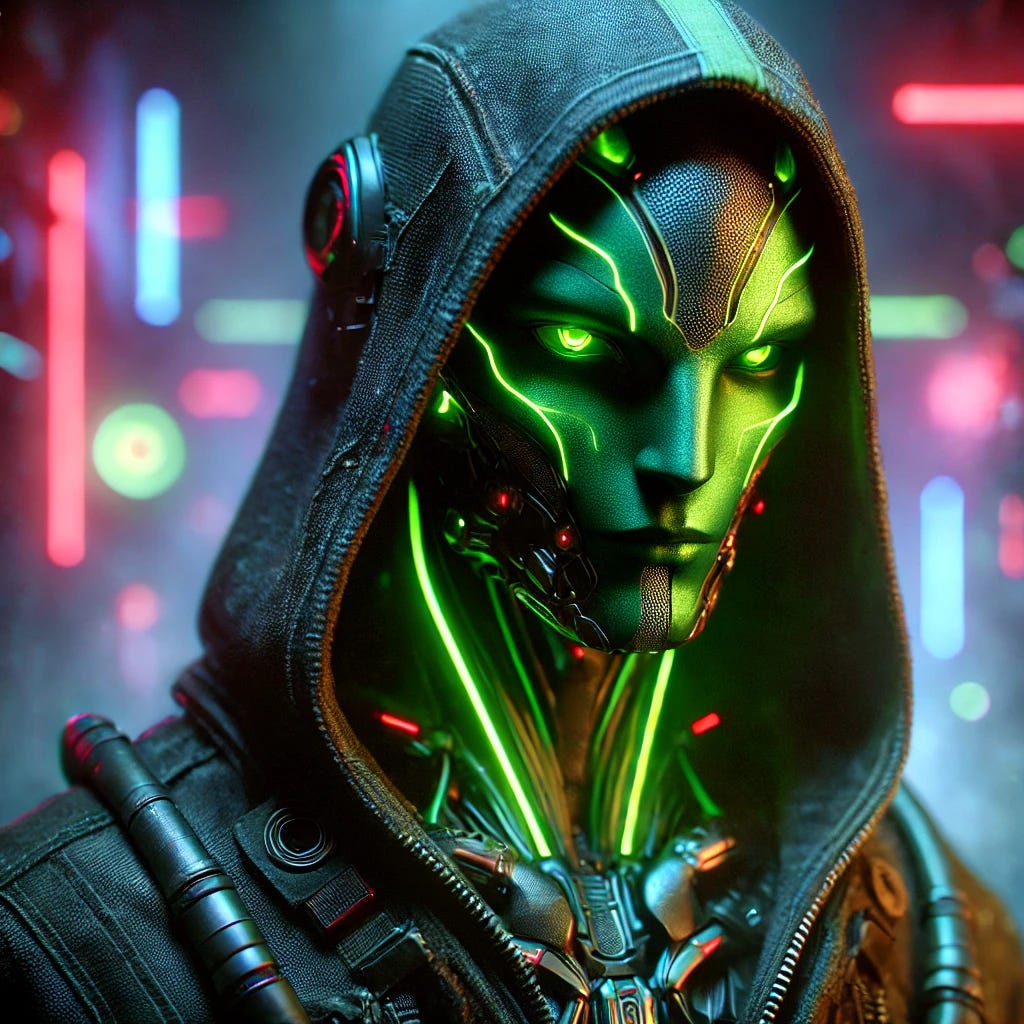
But as we focused on taking the platform to the next level we realised we needed a new brand that better communicated the mission and vision, with our vision ultimately being to build a platform that gives everyone their own personalised AI agent investment managers in DeFi.
So over the past 3 or so months we’ve worked on a new brand for the future of yieldseeker and today we finally release this new branding!
Rebrand logic
Before getting into the new branding I wanted to quickly run through the logic behind it.
Our original brand hadn’t been too deeply thought through and had more of a degen-crypto look about it, which we realised is contrary to yieldseeker’s intention of being a safe place for users to leave their cryptos and earn low-risk yield on autopilot.
So throughout the rebrand you’ll see a clear shift away from the previous more degen and amateur branding to a more professional DeFi-FinTech branding that inspires confidence in users, one that feels solid and reliable yet appeals to both retail and institutions as we already cater to both types of clients and aim to grow both sides.
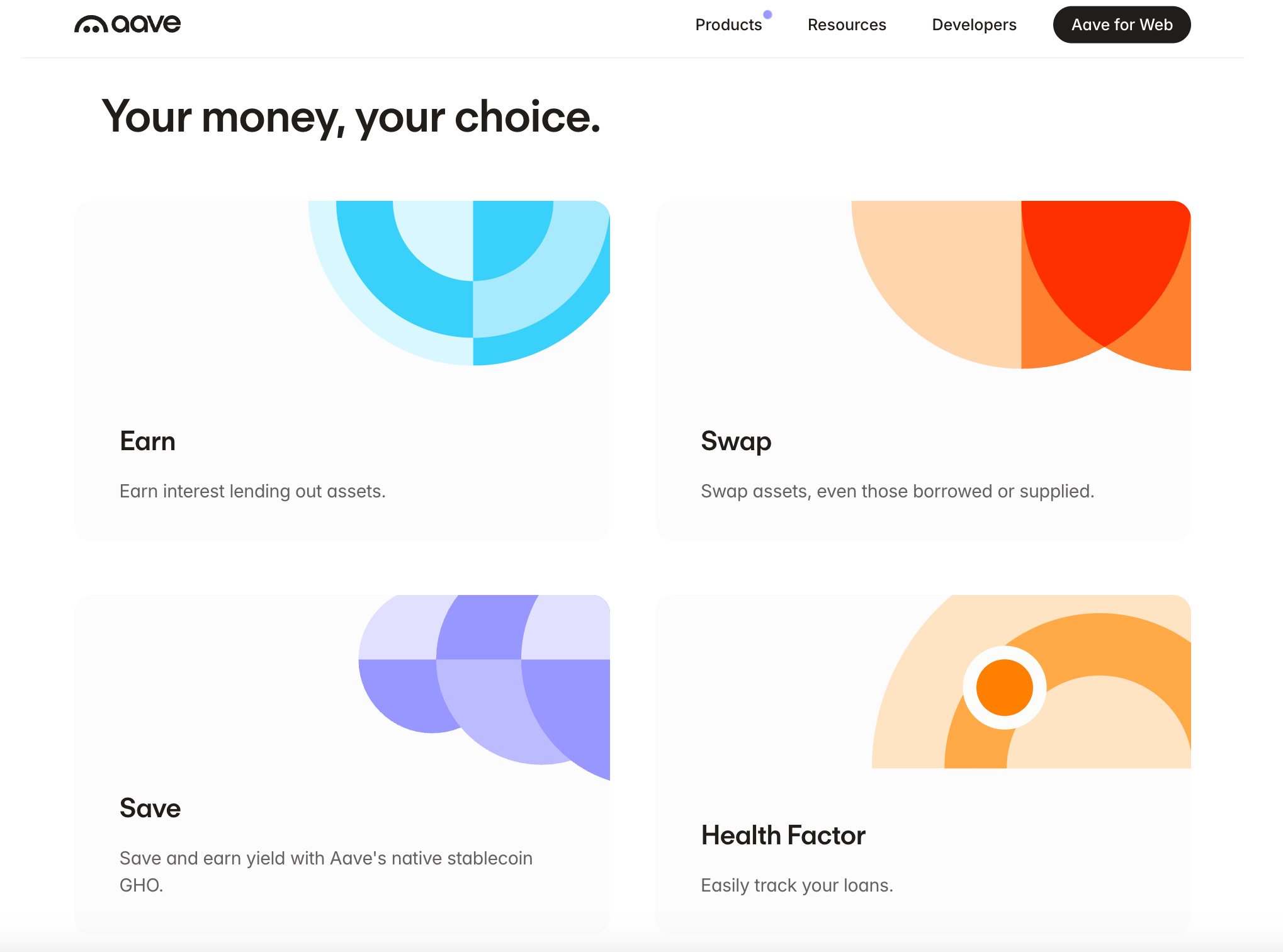
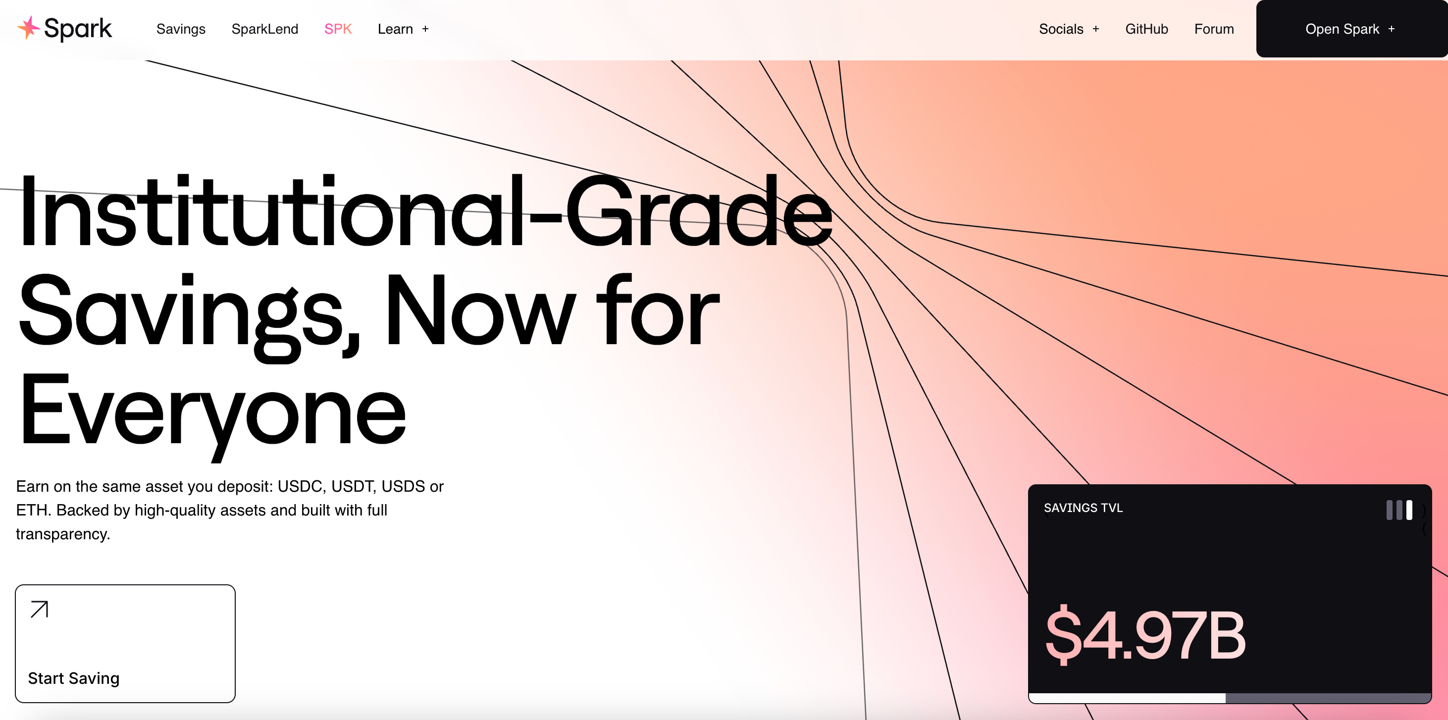
In particular we took inspirations from other DeFi brands we respect like Aave and SparkFi, who are able to do instill this sense of confidence in their platform yet keep their brands clean rather than corporate.
Aave for example have this clean and very trustworthy look going on.
And SparkFi goes for an equally clean look with its geometric shapes in the background.
Importantly we also wanted to keep the green colour from the original branding, which we felt represented well the colour of growth both in the financial context and in nature in general.

With this logic we worked hard to create the new branding below.
Name and Logo
Naturally the very first place we started on was the name “Yield Seeker” which as I mentioned above was originally created to represent our AI character.
We liked the name and decided to keep it, but tweaked it by turning it into the single word “yieldseeker” instead.

While with our logo, we’d never stopped to think very hard about it and had previously just kept our AI character as the logo, which honestly we never really liked.
And rather than having a single all knowing agent, we’ve built a platform where every user gets their own agent, so having a single AI character representing the platform didn’t feel right at all.
Instead we wanted a logo that would reflect growth and were inspired by how plants in nature grow autonomously on their own without needing us to interfere.
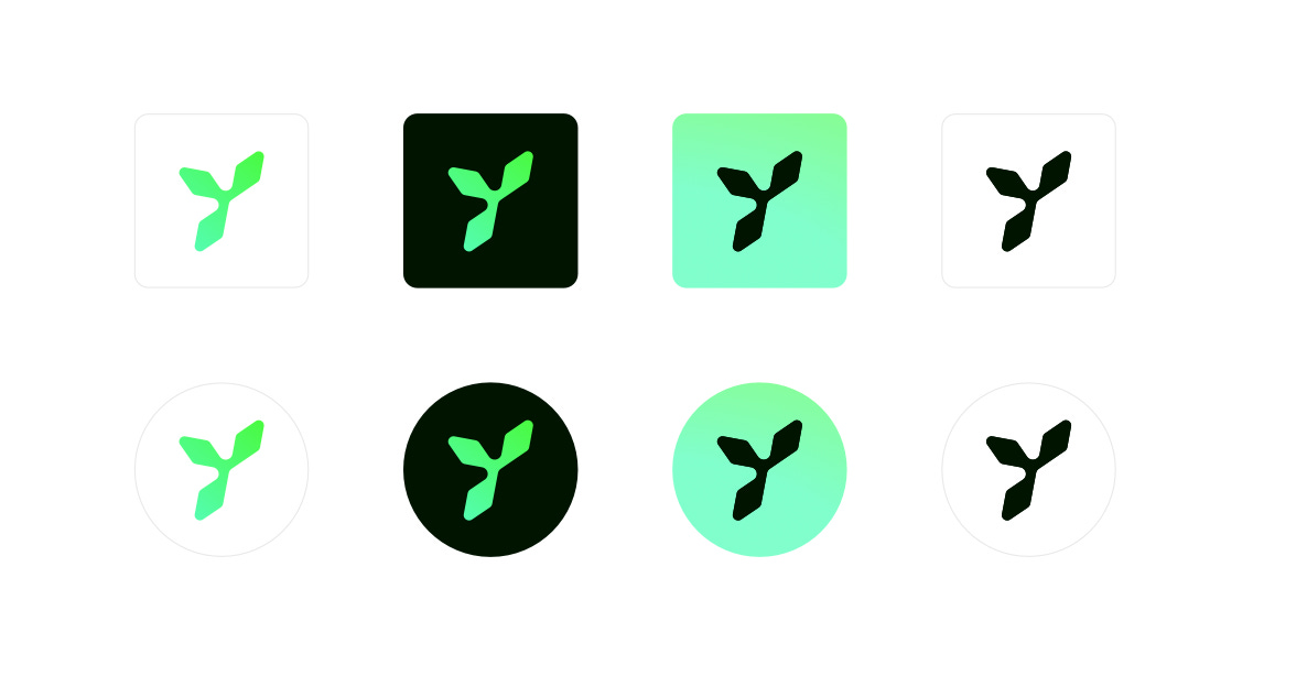
After a lot of iteration we created the plant-like logo below with its three gemoetric green diamond leaves that connect forming a Y shape for yieldseeker.

Each leaf can be separated and viewed on its own, but when brought together symmetrically and given a slight angle they form this characteristic Y.
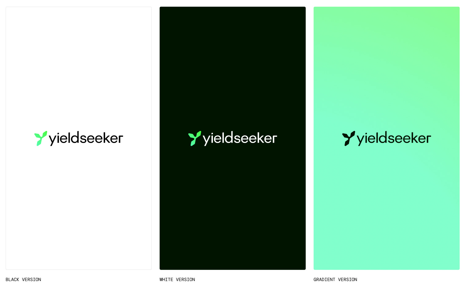
Finally when bringing both the logo and name together we got this:
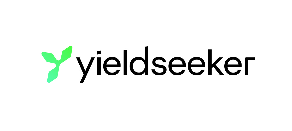
We were pleased with the result as we felt like this new logo design has a clean DeFi-native feel to it and is able to capture nature’s growth with its plant-like elements.
New brand in action
To introduce our new brand we created this short and punchy video below!
With our strong new look and feel we iterated on the design playing around with different colours.
With variations of the logo.
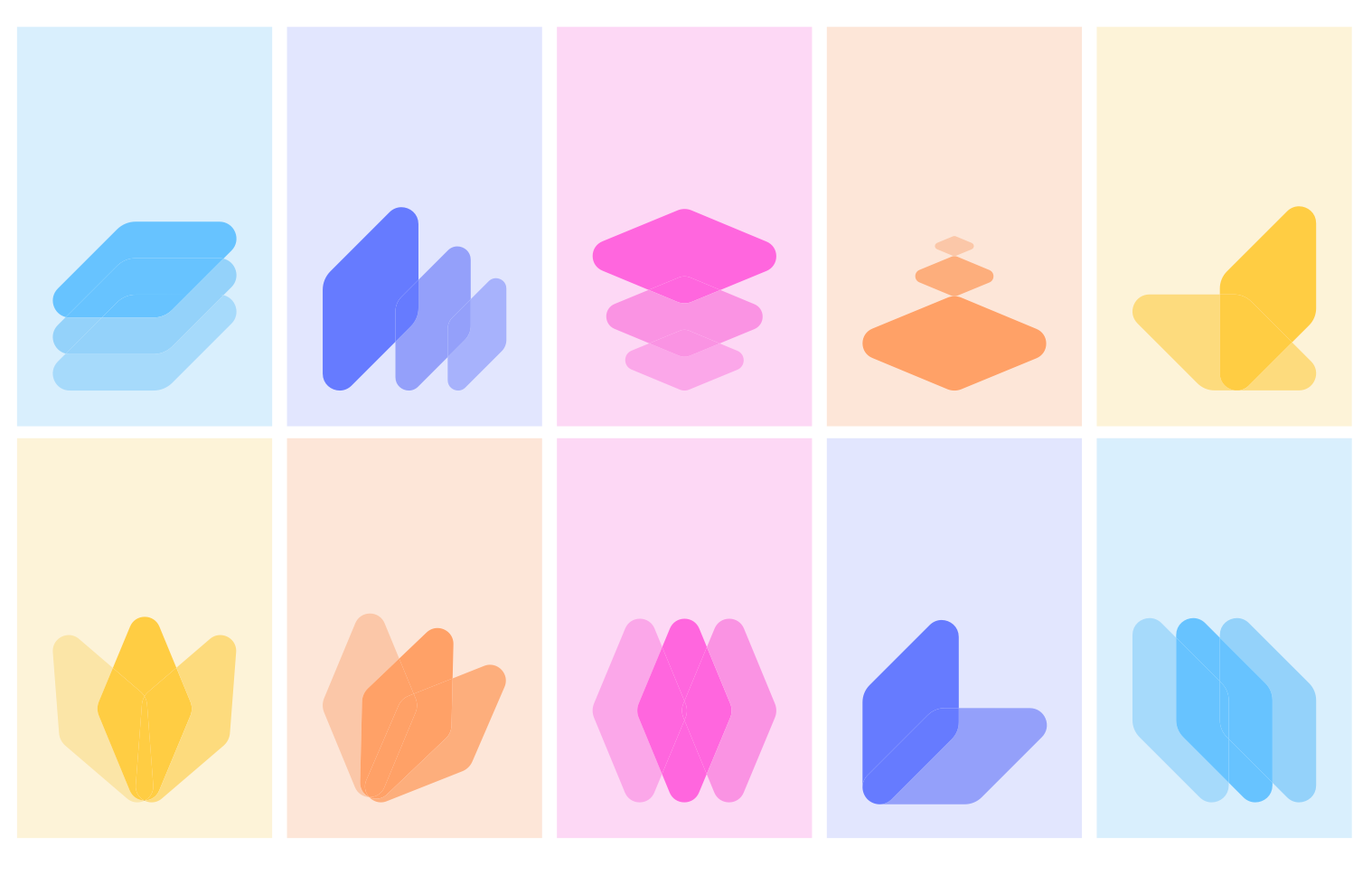
Along with different ways of using the diamond leaves.
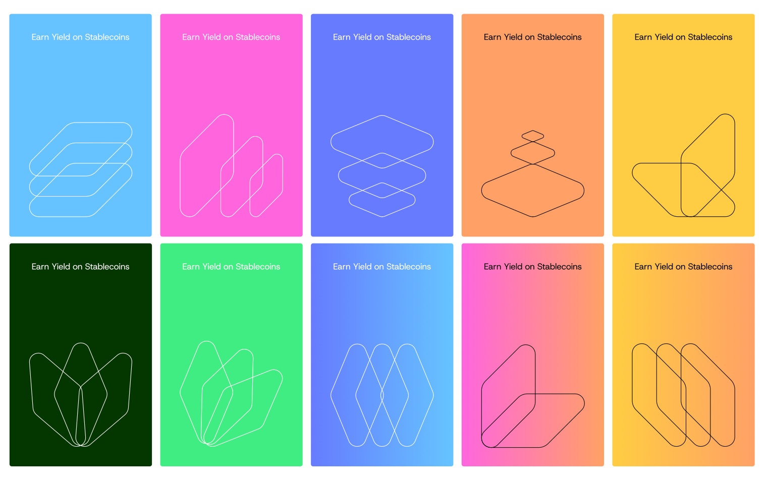
Both with the solid colours above and with the softer pastel colours below.
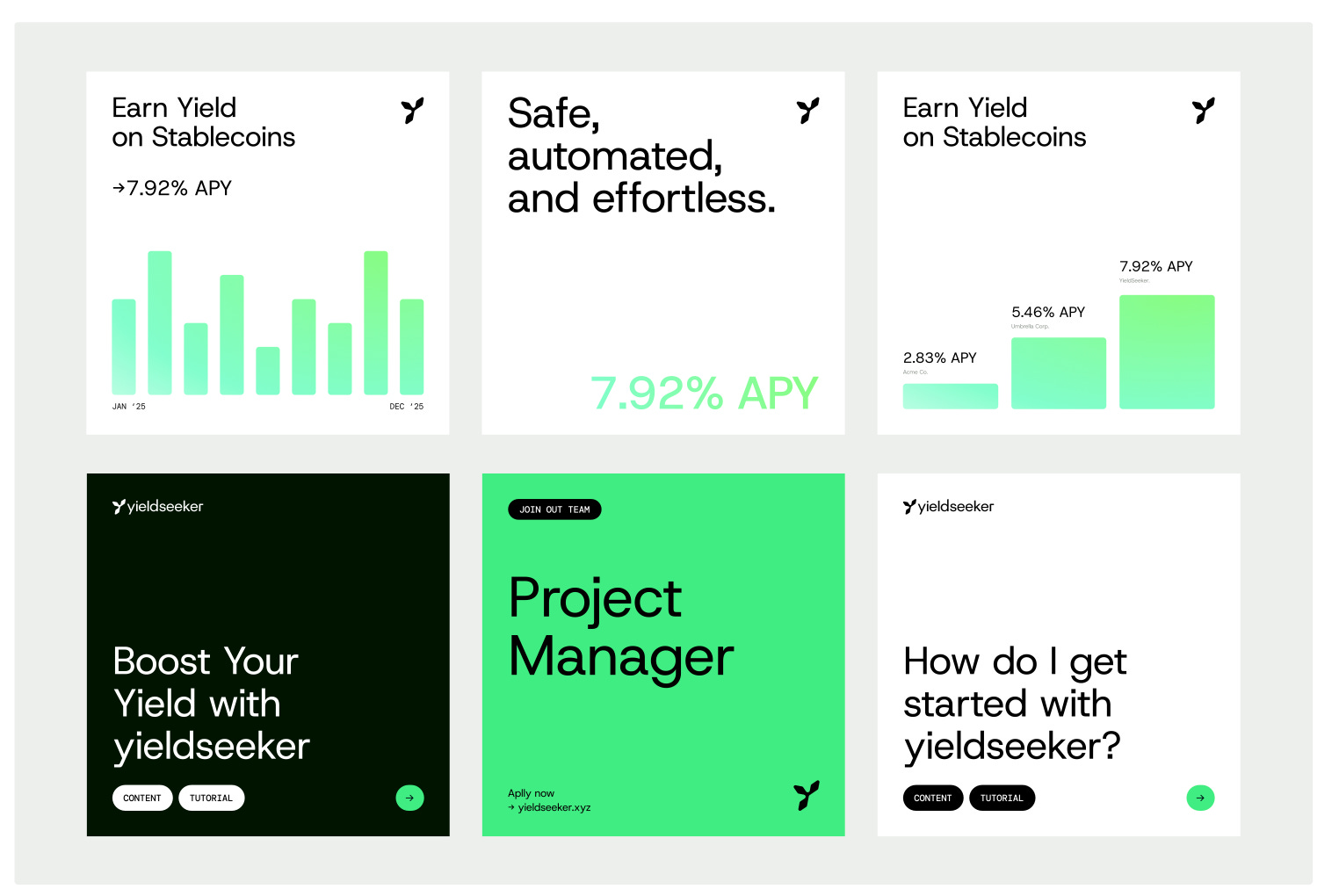
Plus we generated ideas on how to use the new brand with social media.
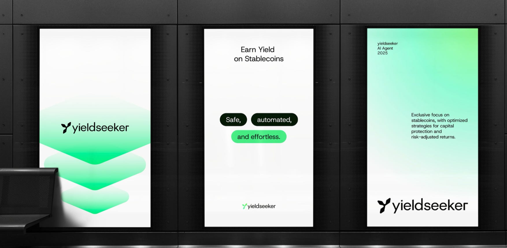
And in real world physical settings.
Website
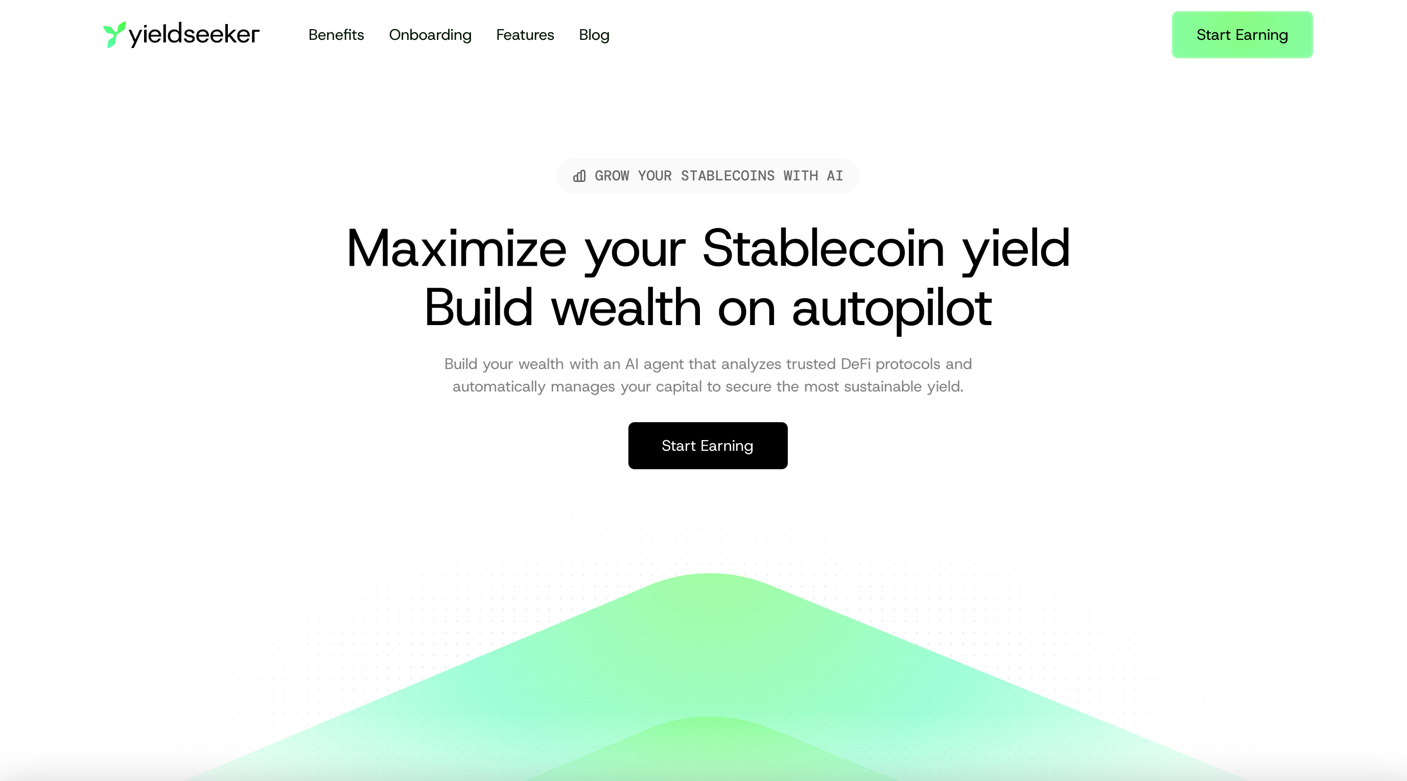
Our new visual branding has now been implemented throughout our Website. The new website’s hero section is now clean, professional and to the point:
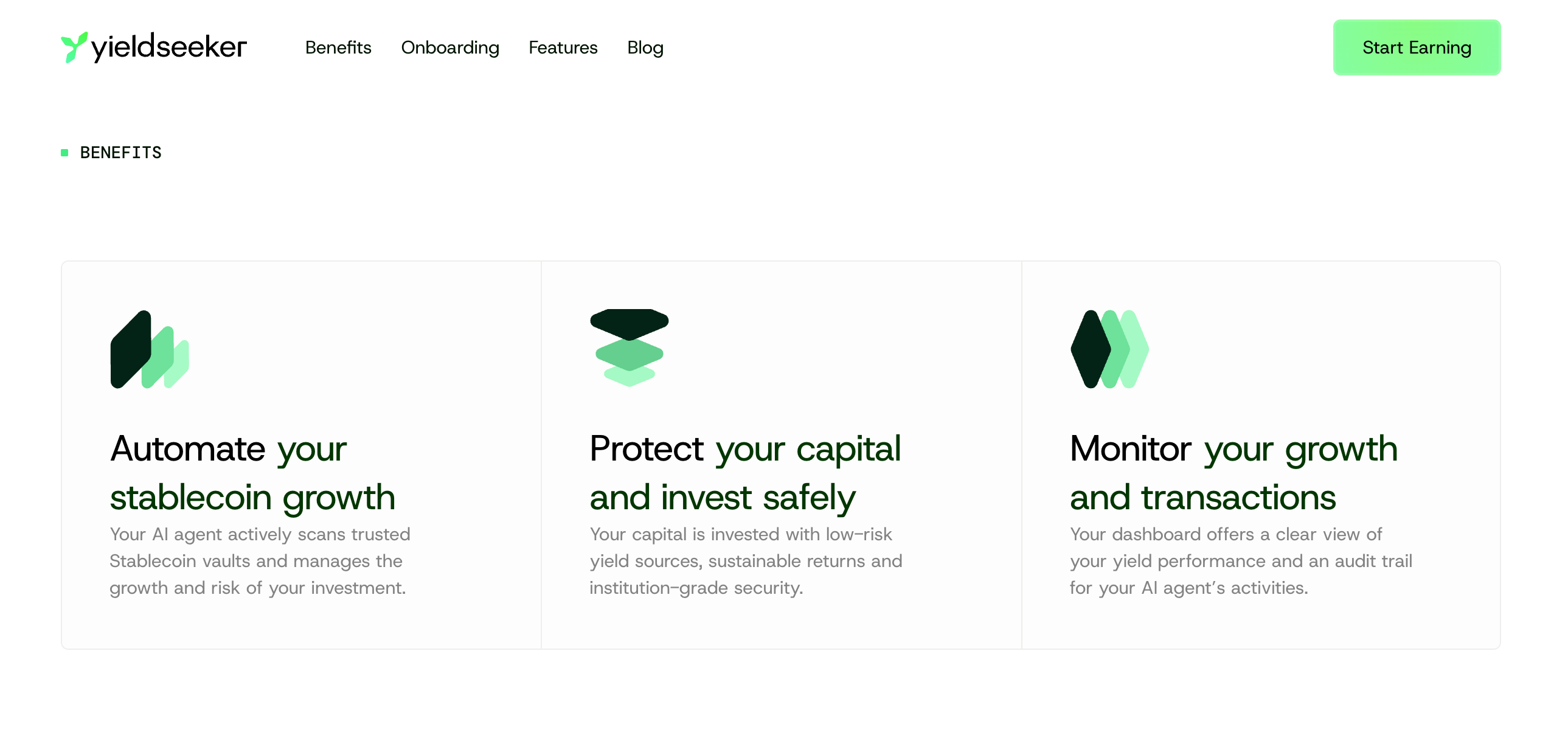
Below it you’ll find the benefits of using yieldseeker.
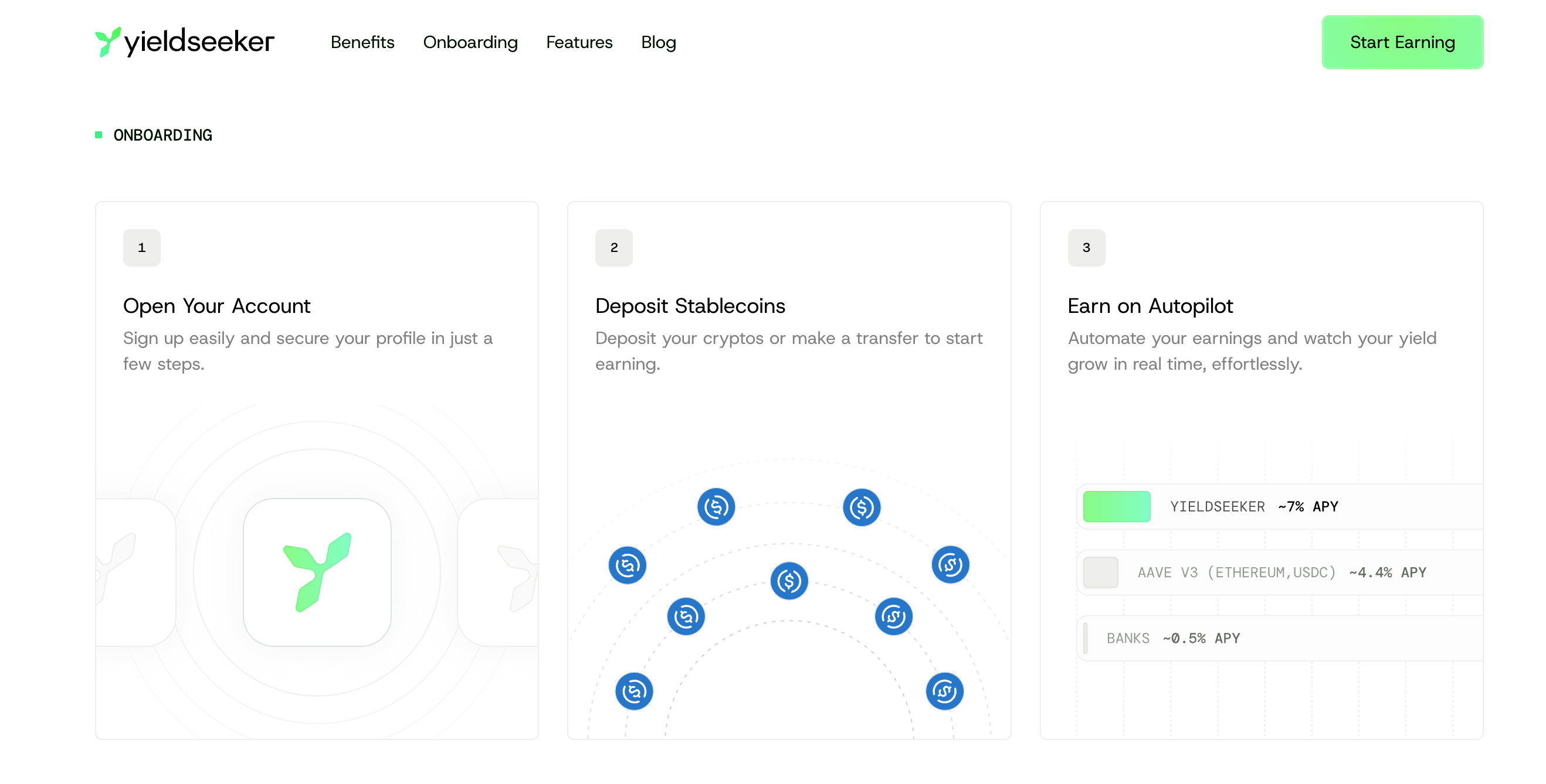
Next you see how simple the onboarding experience is.
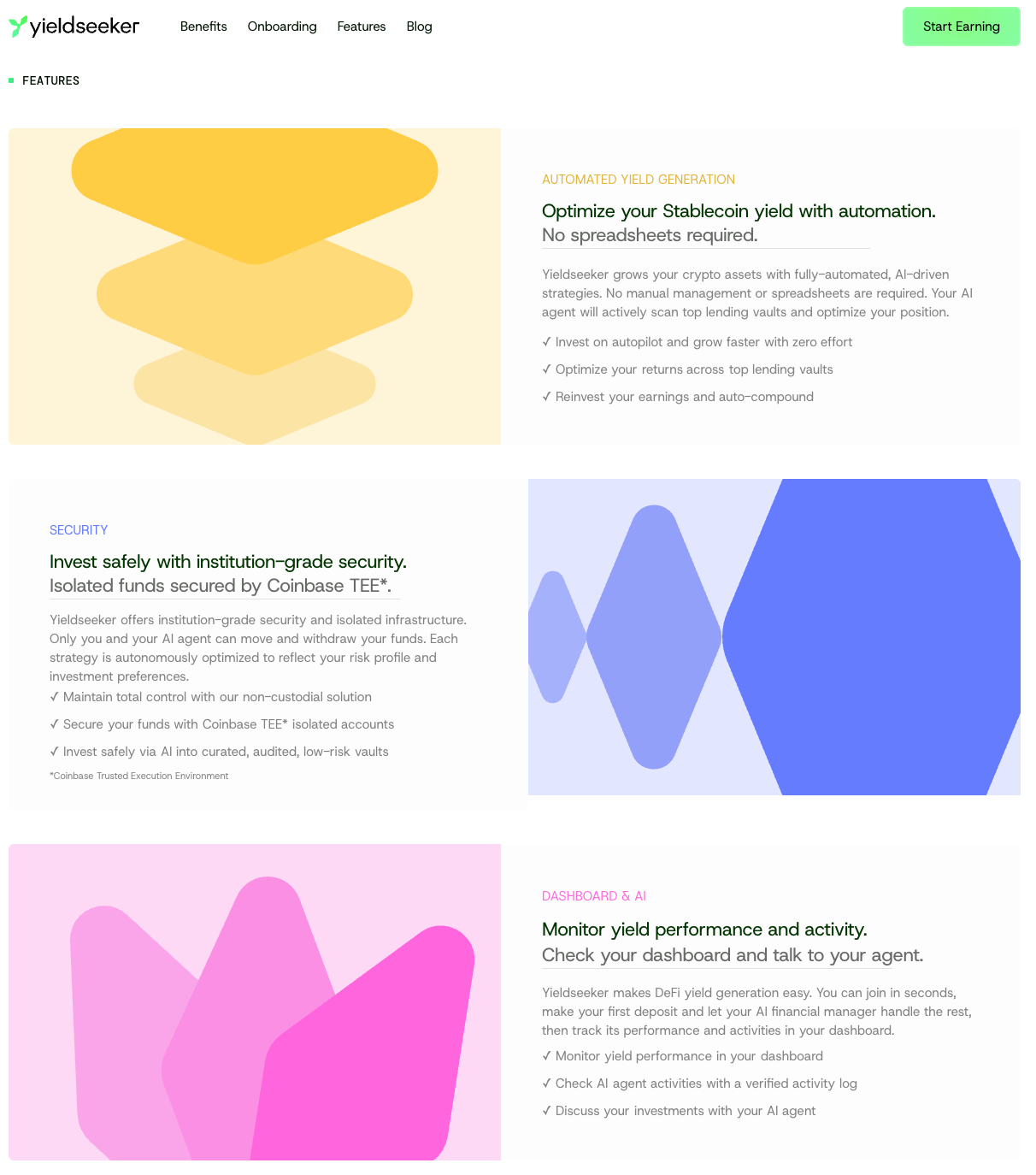
This is followed by a deeper breakdown of the key features of the app.
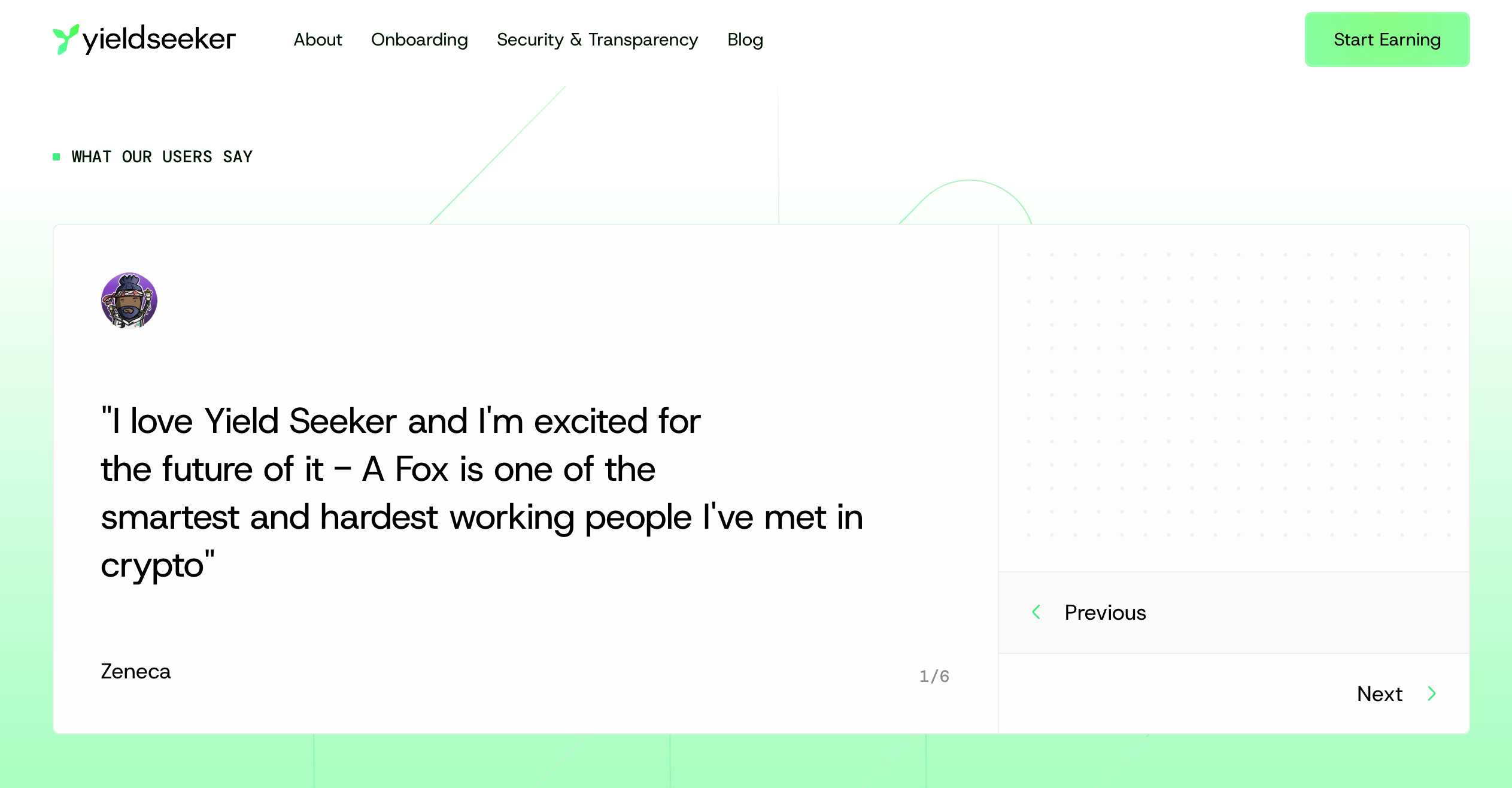
And finally some testimonials from our top users.
We feel this new website is sleak, clean and professional.
Socials, Blog and Docs
We’ve also updated social channels like X, community on Discord, our blog and docs, although we are still implementing it in the app which will come soon.
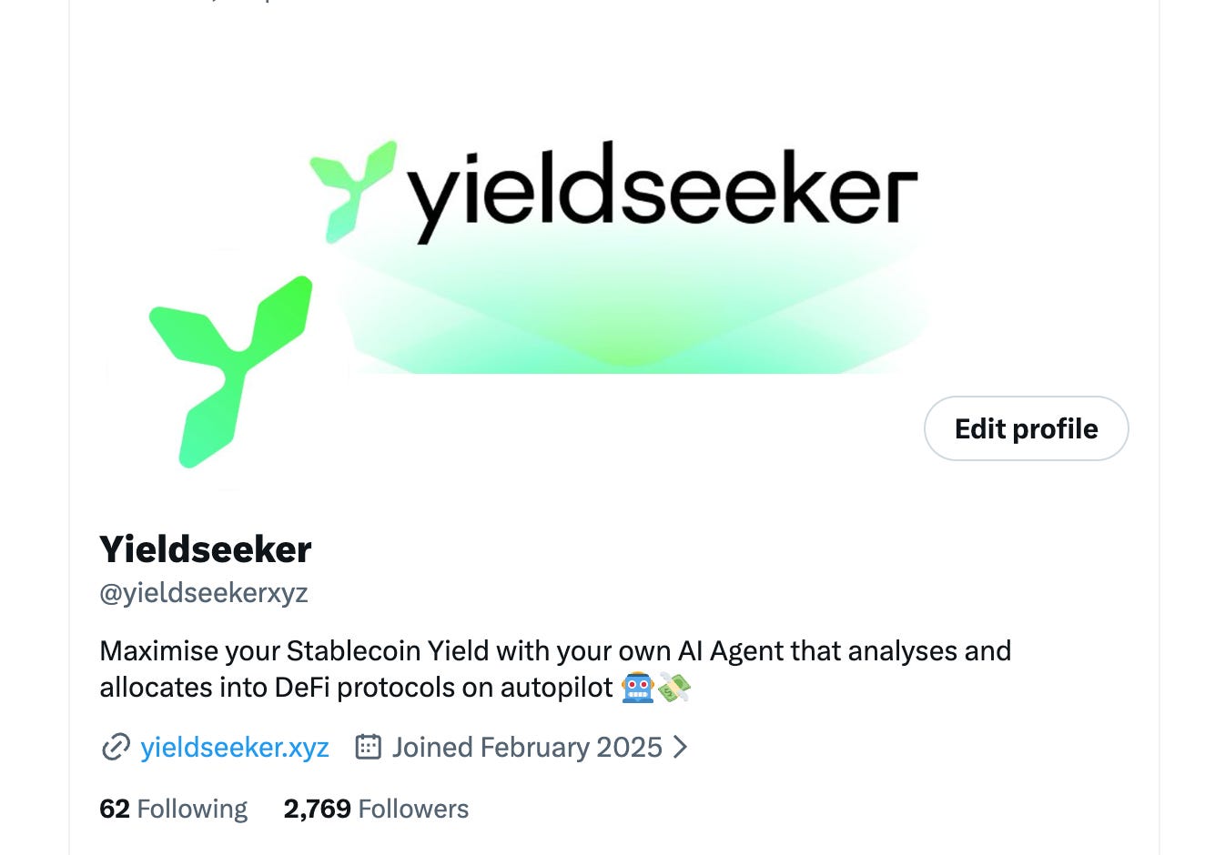
On X you’ll see the new banner and logo live, and on Discord we’ve updated the logo and name too.
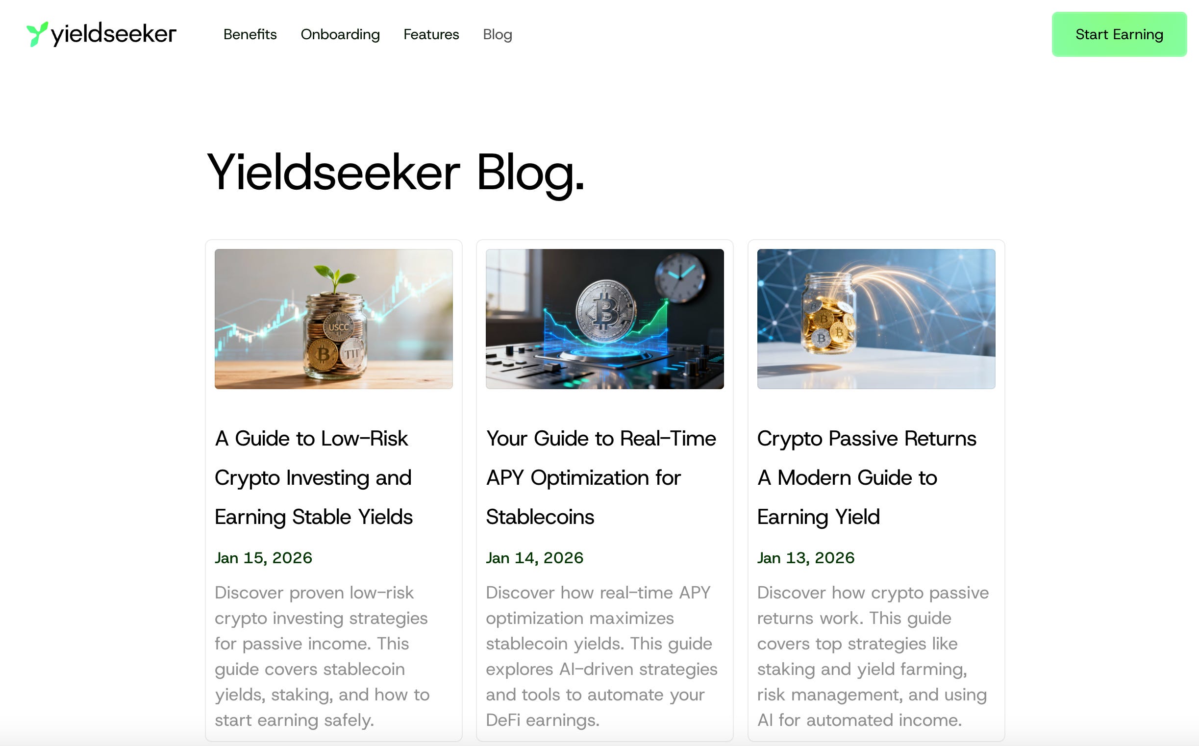
With our blog you can see the new branding in action.
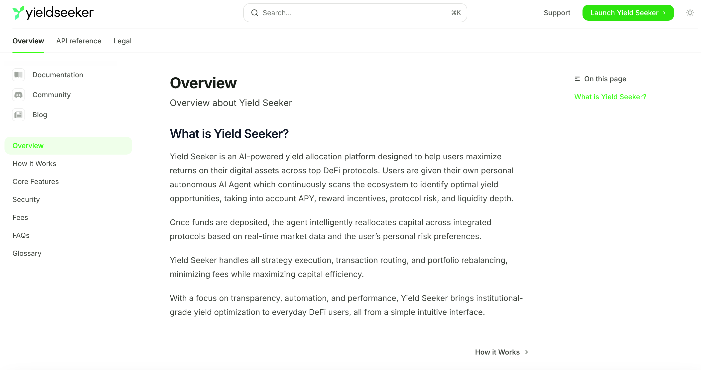
And the same with our Docs.
A lot more to come
We’re starting 2026 with this major new change to yieldseeker’s branding, but there’s still a lot more to come.
Firstly, as I mentioned above the new branding has not yet been reflected within the app and we’re currently working on this to release it soon.
Next, we’re also working on giving users some personalisation over their agent so they can take more control of what it does, for example by selecting how aggressively agents select vaults or limiting certain vaults.
We’ve also been working on a great new smart contract solution, which is a complete first in the crypto-agent space and will both add an additional layer of security to yieldseeker as well as facilitate aggregation of data for sites like defillama.
We’re getting audits for this new smart contract solution done right now, but you can already find out more about them at agentwalletkit.tokenpage.xyz if you’re technically minded and interested in learning more.
And we’re just at the start of 2026, there’s a lot more to come in the year ahead, so keep your eyes peeled for yieldseeker’s growth as it’s going to be an exciting year!

Whenever you’re ready, these are the main ways I can help you:
Want high returns? Earn up to 14% APY with Yieldseeker!
Love Web3 insights? Follow @afoxinweb3 on X!
New to crypto? Join our beginners community to master crypto fast!
Building a Web3 app? Get our expert product development support!
I personally would have used the dark background on X but that might just be me favoring dark mode
but I would still look that the logo is more centered in the X pfp, now it‘s slightly cut on the top right of the logo